EnergyMag
Energymag.gr is an ascending business news portal with a clear focus on energy topics, as well as a broader perspective on financial and investment issues, not only in Greece but also in the international arena, with a special emphasis on the Balkans. Its reconstruction aims to achieve heightened advertising prominence, enhanced readability, esteemed reputation, and a new aura of professionalism.
| Release date | |
| Client | Energymag |
| Sector | News |
| UI & UX Design | Vivian Argiri |
| Front-End Development | Irene Paliogianni |
| Back-End Development | Sofia Tsimtsiou, Thanos Poulitsas |
| Project Management | Ioanna Papaioannou |
| Account Management | Maria Vlahostathopoulou |
Typography
TYPE YOUR TEXTCF Asty
Literata
Color Palette
EXPLORE ALL COLORS SWIPE TO EXPLORE ALL COLORSAn aspiring new collaboration
EnergyMag placed their full trust in us, drawn by our proven track record of excellence and specialty in news portals. Thus, a transformative partnership was forged.
The primary goal was to elevate the entire website to align with contemporary aesthetic and technological benchmarks. We set out to craft a cutting-edge news portal that seamlessly guides users through an easy-to-navigate-through and solid online experience.
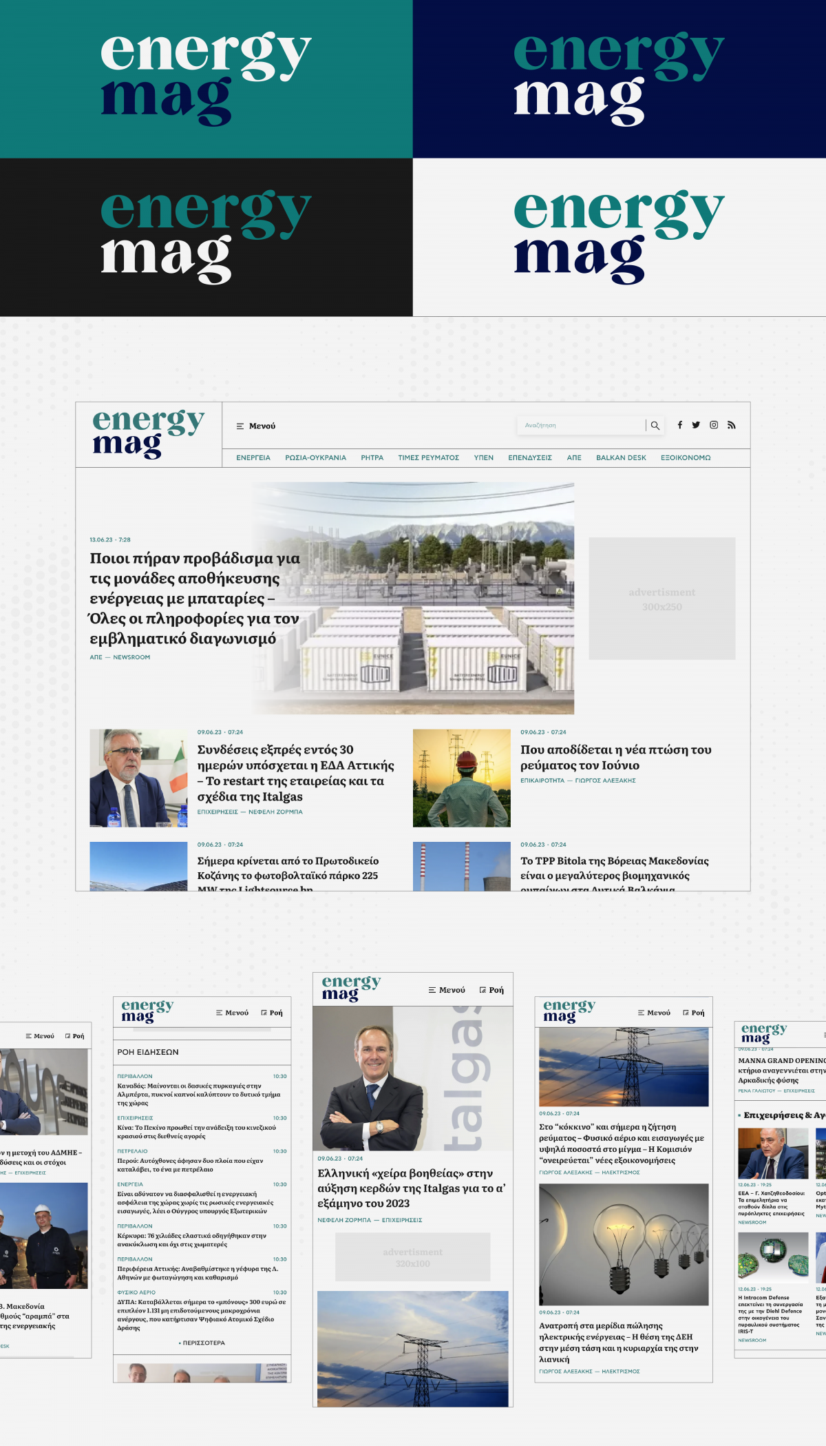
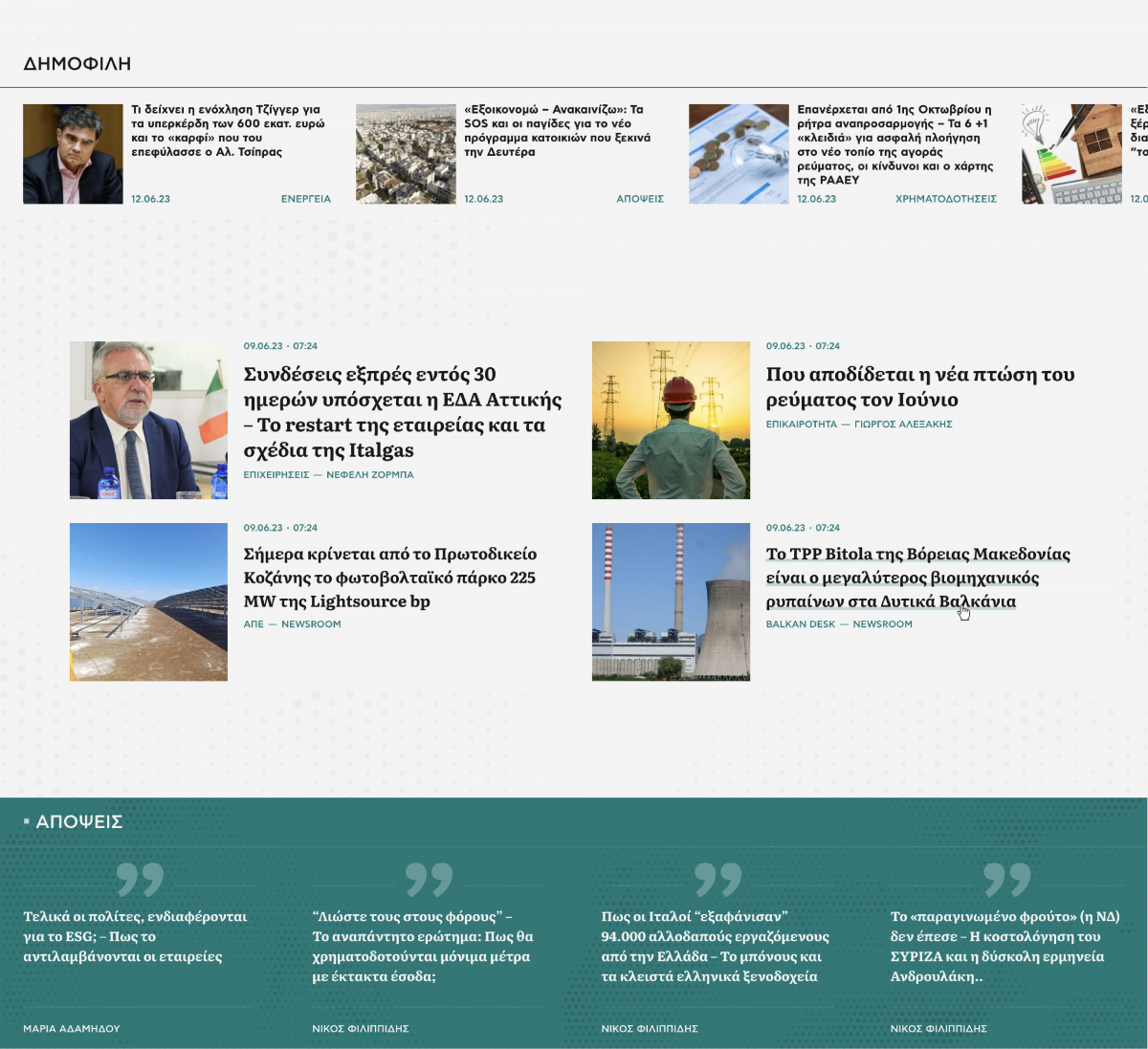
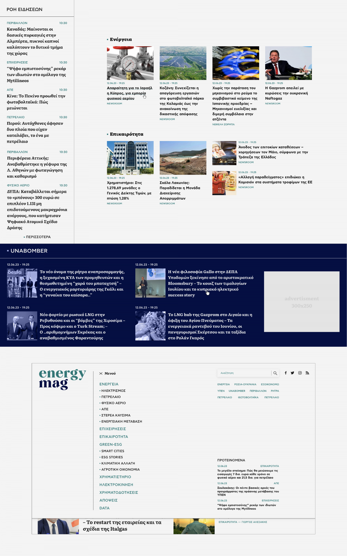
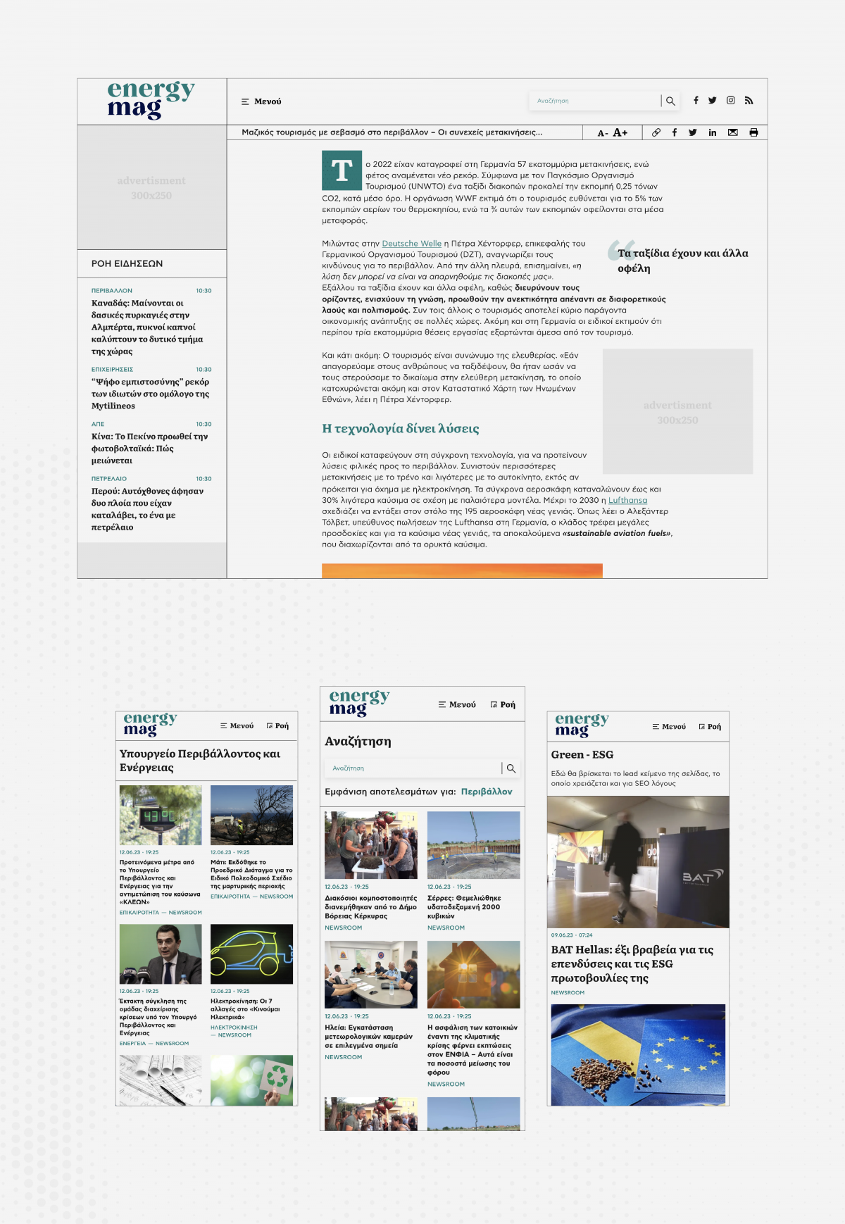
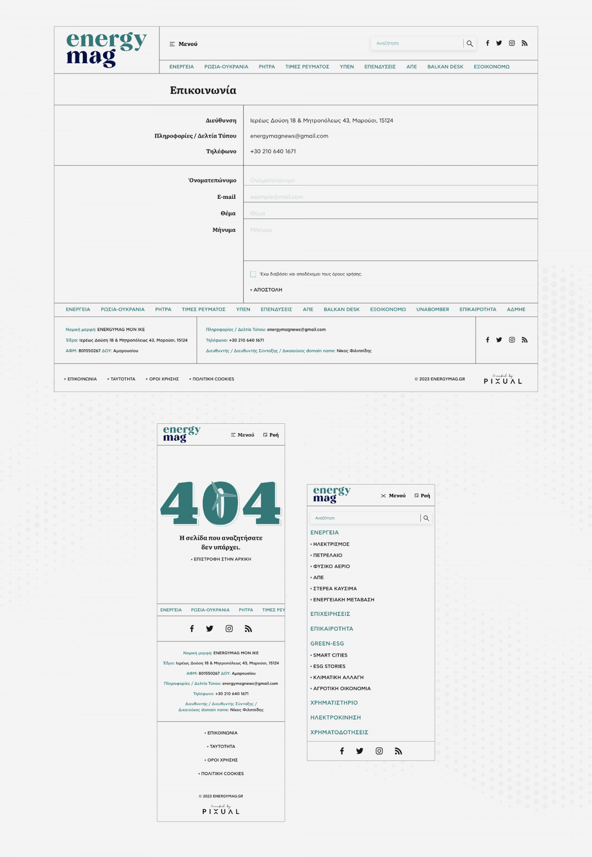
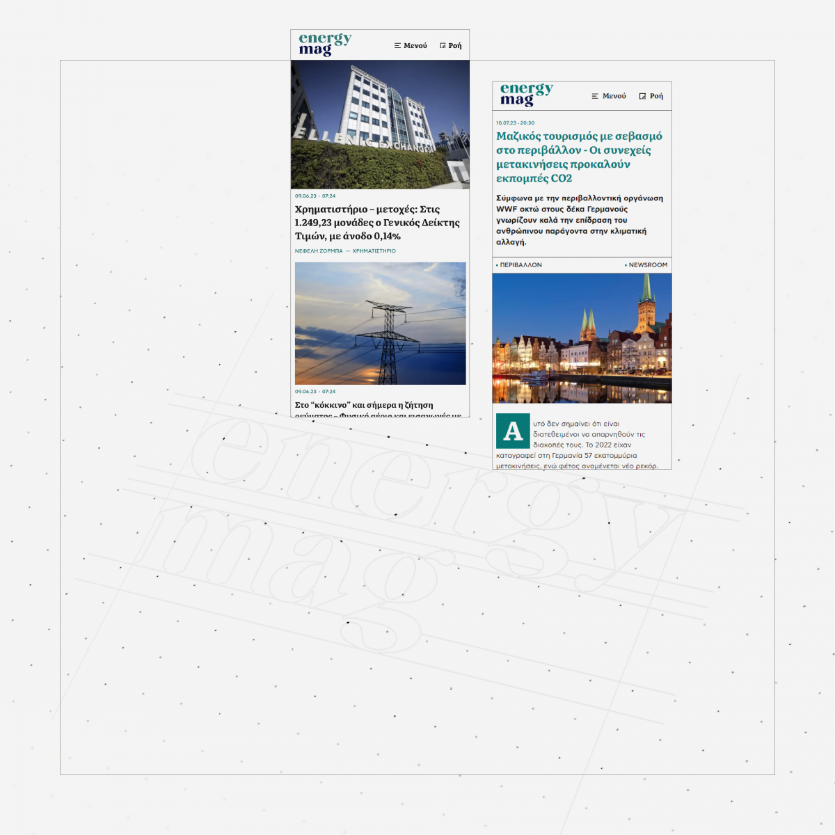
Our efforts started with an in-depth exploration of UI/UX, delving into industry best practices. The revamped design embodies sleek minimalism, strategic almost-white space - with a slight newspaper feeling-, and intuitive navigation. The design department meticulously fashioned a fresh logo and introduced a vibrant color palette that embodies the dynamic essence of EnergyMag. These carefully selected shapes and hues echo the rejuvenated identity that EnergyMag aspires to project, standing out in the industry.
The primary colors evoke tranquility and simplicity, and at the same time they convey authority and elegance, together creating a harmonious balance of calm and sophistication in the design.
The petrol (blue green) shades represent nature and harmony, exuding elegance and grace, to infuse the palette with a touch of natural serenity and refined luxury. These hues harmoniously resonate with the earth's elements, seamlessly aligning with the website's core focus on energy and environmental sectors, coupled with a modern and contemporary allure, instilling a sense of freshness, and security to the readers.
The deep blue color, reminiscent of the ocean's calming depths, adds a sense of reliability and professionalism, enhancing the final outcome with a feeling of trust and clarity.
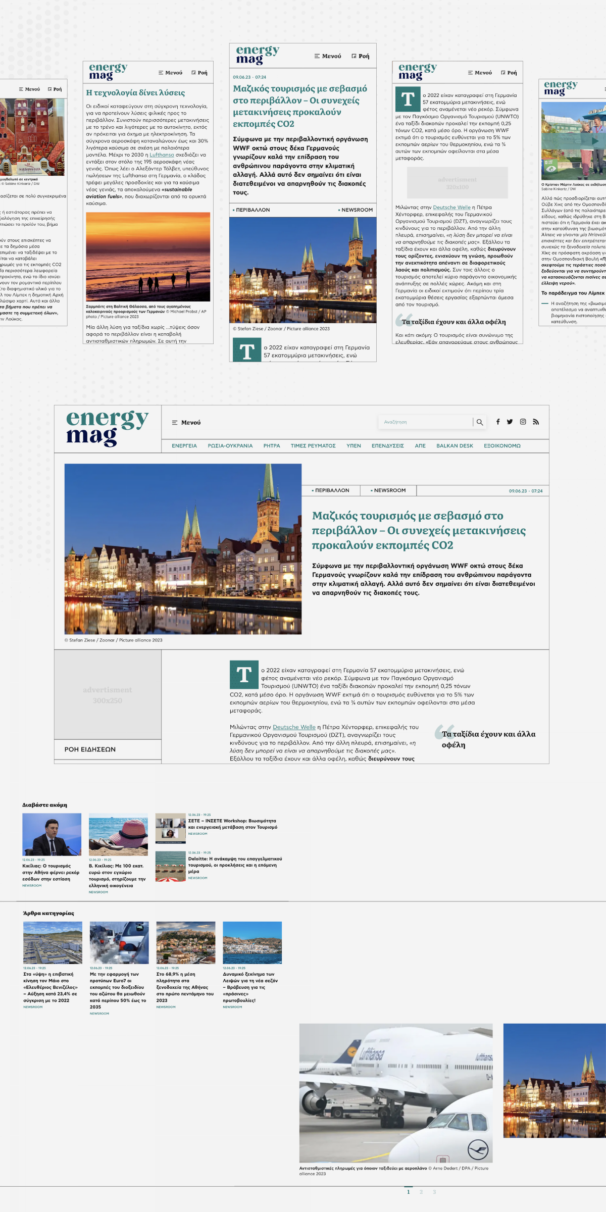
The article's minimalistic design enforces uninterrupted reading, showcasing bold headlines and notable bylines. Crucial authoring information, focused interlinking and related topics, add-up to the user's experience, enforcing them to move on with their navigation through the portal after each article's reading. Quick-access social sharing buttons empower readers to effortlessly spread engaging stories across various social platforms. A dynamic accompanying sidebar keeps the readers updated with the latest news, ensuring an enriched browsing experience.
Subsequently, our tech team undertook the task of migrating the content from WordPress to the cutting-edge, more robust and reliable Drupal 9. The CMS was custom-built to provide editors with a user-friendly interface, streamlining their workflow and enhancing overall efficiency, while at the same time provides to the readers a greatly performant experience and to search engines a highly optimized portal.
The whole advertising system is transferred to Google Ad Manager to give the commercial department a powerful tool with enhanced functionalities that scale up the medium's potential. Each advertising position is placed thoroughly to blend with the content, without being an obstacle to user's seamless navigation.
After a few months of dedicated effort and craftsmanship, we proudly unveil a fully functional website that bears little resemblance to its former self, except for the unwavering dedication of its talented news reporters.
