Ethnos
Ethnos is a nationwide political newspaper with a long-standing presence in the field of printed information. It was the first color tabloid newspaper in Greece, a true pioneer at its time.
| Release date | |
| Client | Dimera |
| Sector | News |
| UX | Irene Paliogianni, Nikolas Grigoriou, Thanos Poulitsas |
| UI Design | Nikolas Grigoriou |
| Front-end Development | Irene Paliogianni, Aris Vomviras |
| Back-end Development | Thanos Poulitsas |
| Account Management | Dioni Tegou |
| Awards |
|
A historical brand, an innovative, user-centric news portal
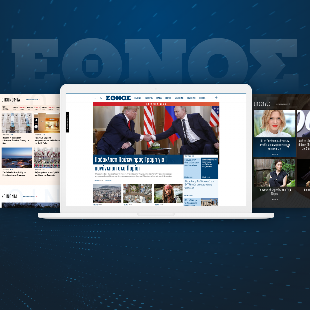
Our goal for the design and development of Ethnos' digital 'residence' was to bring all the values that governed the print version to the web and at the same time give all the additional features that a modern news portal should provide.
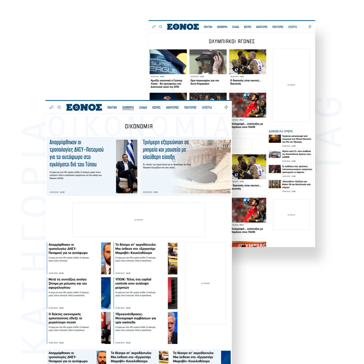
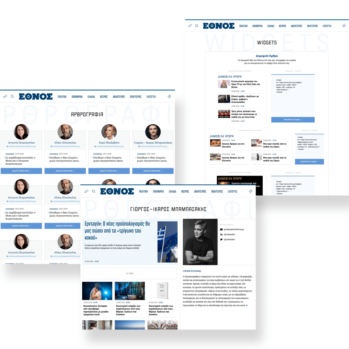
The color palette was kept close -with adjustments for accessibility reasons- to the totally refurbished newspaper, while the fonts used were the same. Apart from the references of the paper, clean and classy aesthetics led the design process, while always keeping in mind the functional part of it and setting as a core goal to greatly facilitate the user experience.
Such a brand definitely needed to make a breakthrough upon its release and introduce new features to the digital news sector. That's why, along with very distinctive looks from the rest of competition, some unique key elements made their appearance.
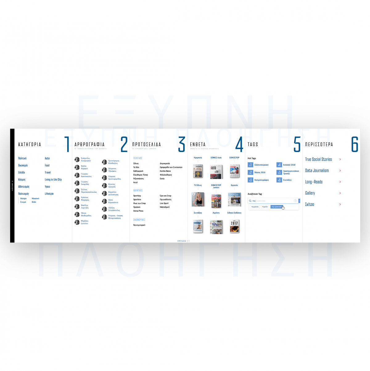
Instead of the typical burger with a list of main article categories, we launched a versatile navigation tool with a 'touch' of an open newspaper, where every category / link / feature of the site is easily accessible, be it categories, tags, newspapers, add-ons, bloggers, etc. This area aims to answer every user's questions. For the desktop users particularly, we crafted a second 'Quick navigation' CTA, apart from the burger, so that users that are not familiar with the known icon or avoid to use it because they think they already know what's in there, are triggered.
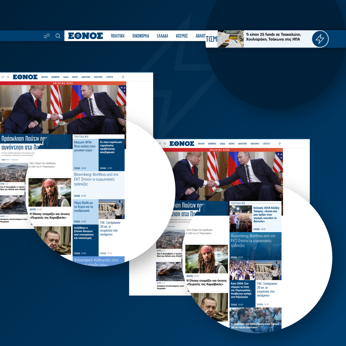
The latest news data were also reconsidered. News, authority, speed and originality are all terms bind to the most essential part of a newsroom; the current affairs. All reporters strive for the most accurate, fresh, well served story and the website should take into serious account that effort. A small thunder appeared in the header, next to the main menu, that seems like a common shortcut to the latest news page; nothing really special about it. If you wait though (surfing through the site) for a new article to be published a discrete beep is heard and the thunder reveals it's teaser in real time notifying that something new has just been served, so that you can visit it instantly. That's a tiny little -visually and acoustically- asset, with a huge gain for the website, as the user doesn't have to visit the news page all the time, not even keep their mind to a specific sticky section expecting something new to appear.
Additionally to the 'cool staff', we paid special attention to create (having a great helping hand from our beloved Drupal 8 with some 'Pixual twists') an admin interface as easy, usable and accessible as possible, so that quick news coverage, which is crucial to a competitive news portal, was possible.
All the efforts -both from Pixual and Ethnos' newsroom- seem to have well paid off and be much appreciated with an impressive outcome. Ethnos managed in a very short period of time -having always our team on its side- to become a daily habit for the vast majority of its visitors and reach trully desired heights; more than 2.5 million unique users visited it monthly before its 1st year and more than 7 million after 1.5 years making Ethnos the fastest grown news portal in Greece.
Typography
TYPE YOUR TEXTPF Das Grotesk Pro
PF DIN Serif
PF Venue
Color Palette
HOVER TO EXPLORE ALL COLORS SWIPE TO EXPLORE ALL COLORSHome: a not-so-traditional landing page
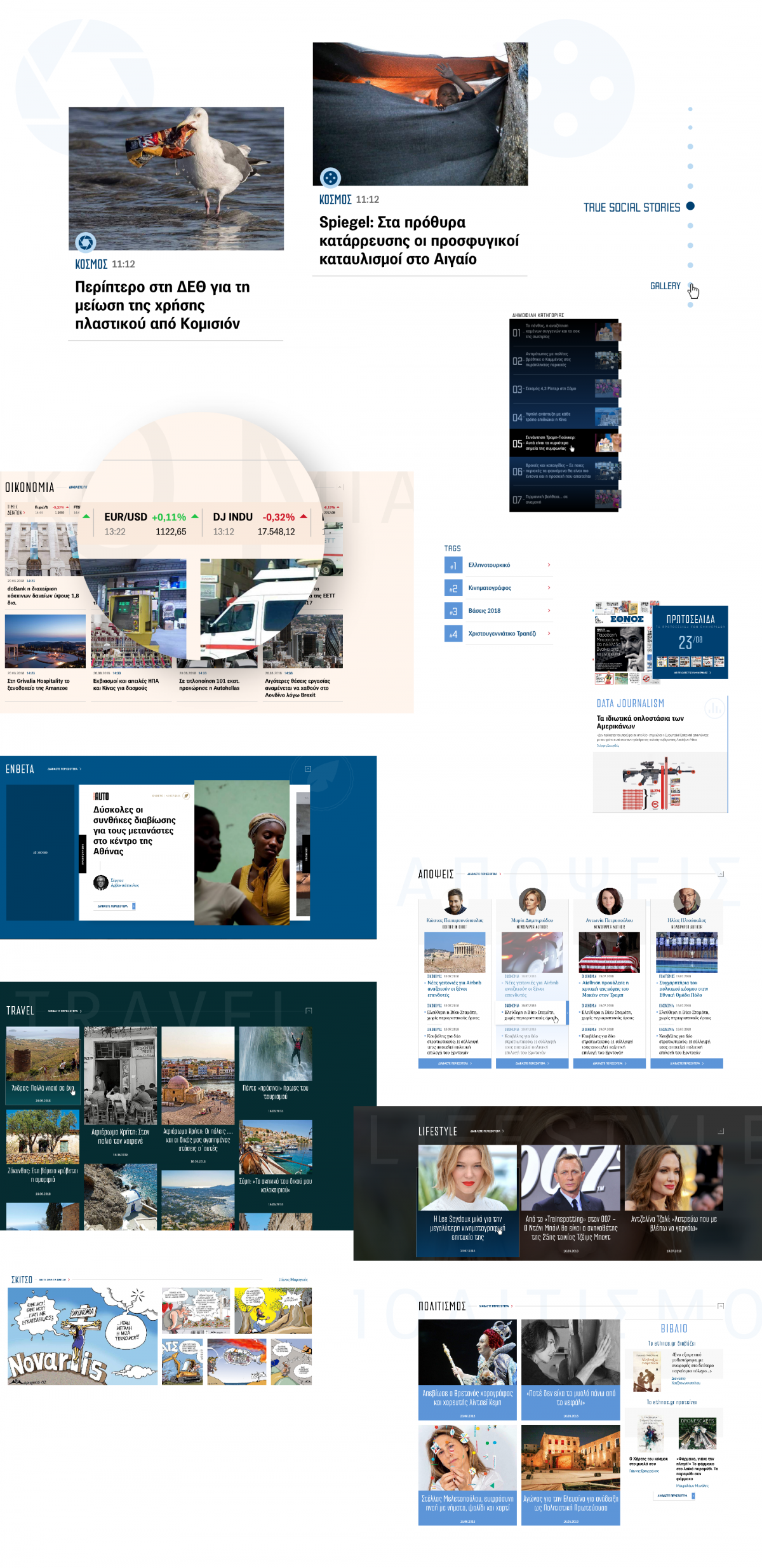
Homepage is the long-established, by-default landing page, as people that visit directly a website, well.... land on this page. It is -along with the article page- one of the most important pages of the website; it is the whole project's image, it sets the tone of the current affairs, it presents its aesthetics, what's important for its editors and what they believe that interests its users and it usually defines the loyal user's navigation.
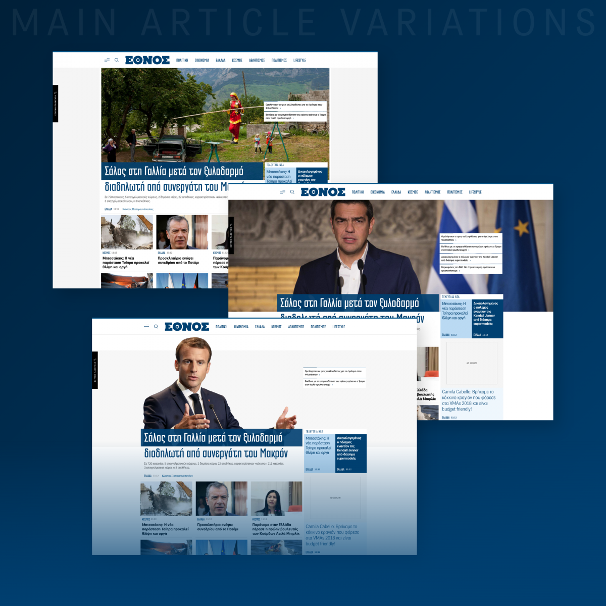
We decided that the first view of such a historical newspaper brand should resemble the cover of the paper. That's why we focused on a single main topic -giving the editors the ability to add related articles, cover the full width of the browser or put a spotlight on a person- and placed the latest news on its side bottom, so that it's clear what's important and what's new.
Latest news are a very essential part of a news portal -as already explained-, so it was only natural to appear on a hotspot, right next to the main topics of the day. At first, due to editors' hesitations on the ability to have a cover image for every breaking news that occurs, we had to move on with title-only teasers, which led us to look for an uncommon way to display that area, so that it catches the visitors eye without the appreciable at any rate accompanying photo. That's how we came up with an unconventional blue-shaded (but not disturbing) pattern, which after a while ended up to have photos and made the medium's mark to a wide variety of topics. The same pattern was accessible through the header's thunder, with the ability to stay sticky through the user's navigation on any page.
Though sticky information was mainly used for sidebars thus far, the multiple needs of such a homepage -both content and advertising ones- drove us to extend this capability to all its sections in order to keep content accessible as long as possible with minimum distractions and alterations.
The need of a medium to show the wide range of different topics it covers is the main reason that almost all news portals' home pages tend to be huge; to satisfy all their users' desires. That may bring plurality and cover the medium's goals for the home page, but at the same time it is confusing and overwhelming for most of its visitors and may have opposite results than the expected ones, with annoyed users and low viewability rates of both articles and advertising components. We managed to make our way out of that issue by adjusting each thematic section to be collapsible so as to encourage users to make their 'own' personalized homepage according to their preferences and 'excluding' from their viewport (always having the ability to expand a section again) all content they are not keen on. Additionally, a mini sticky side menu of all homepage departments gave each user that wants to explore a certain area the opportunity to scroll there faster, reducing the risk of abandoning the website instead of searching further for what they are interested in.
Fast news coverage usually doesn't leave much space for good visual content, hence where exceptional photo is available -for example in travel, food, add-ons and by definition galleries and sketches- we aimed for diverse appearances with either portrait, polaroid or comics style displays to enhance that precious material.
Last but not least, advertising areas were integrated along with the content, in a way that viewability is boosted without interfering to the user's surfing or reading, making Ethnos' homepage a happy place for the advertiser, the editor and most of all the reader.
The App: for the loyal ones
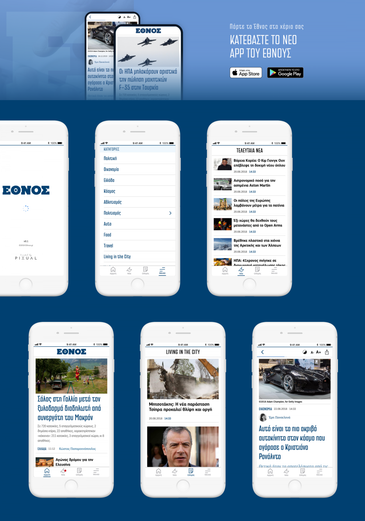
Built and designed for both Android and Apple users, the main goal here was to create an easy-to-use, while truly fast mobile app.
The design principles remain the same as established for the website, so that the loyal user of Ethnos navigates through a familiar environment on both website and app. In contrast to the website -where different sections are in tunes with each other but at the same time diverse- though, the app's key design and functional feature is simplicity.
Performance is the first priority for this app's functionality, as it's part of a highly competitive sector, where even seconds in the news publishing can make a difference.
Navigate through the most important articles of the day, latest news, the guide section (a significant part of Ethnos coverage) and each news category separately, conveniently from your phone, just by visiting your phone's store and downloading the Ethnos app for free.
