Proson
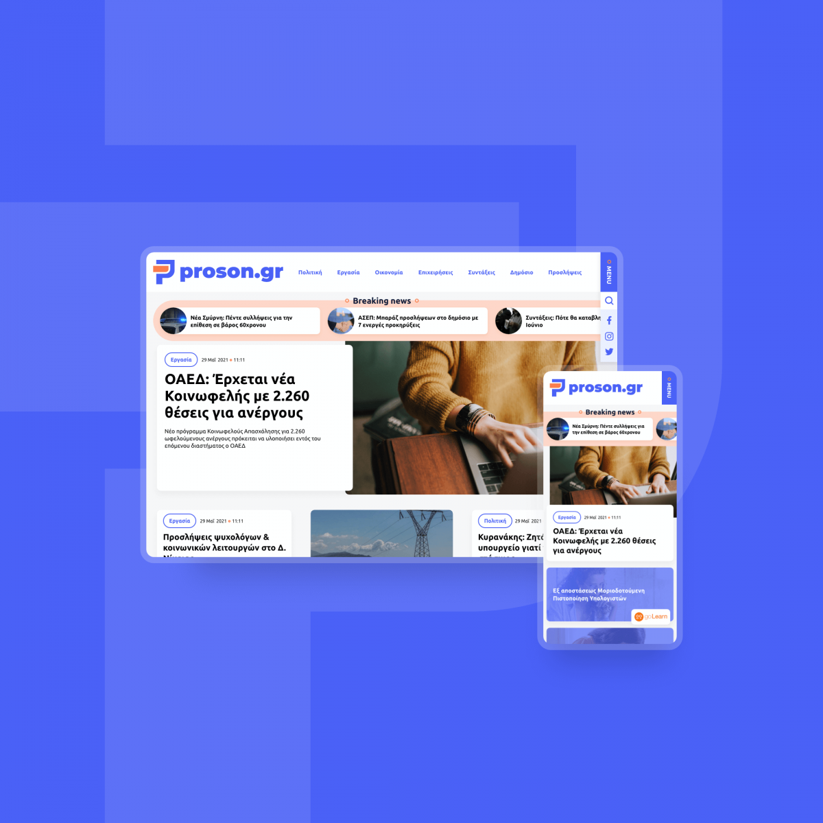
Proson.gr began its digital journey in 2003 as a place for job postings. Today it's a totally revamped news portal with articles and more info about employment, ASEP proclamations, politics, society and much more.
| Release date | |
| Client | Alfavita |
| Sector | News, Public Sector |
| UX / UI Design | Despina Alafouzou |
| Front-end Development | Aris Vomviras |
| Back-end Development | Sofia Tsimtsiou |
| Account Management | Dioni Tegou |

Typography
TYPE YOUR TEXTUbuntu
Color Palette
HOVER TO EXPLORE ALL COLORS SWIPE TO EXPLORE ALL COLORSWhat we delivered
Proson was in need for a new identity and a new destination. We provided the first and set the ideal environment for the second one.
The new proson.gr consists of a clear yet harmonic style with rounded cards and CTAs to foster a friendly mood that encourages users to focus on the content and not the container itself. A well built and organized visual hierarchy was introduced to force uninterrupted and intuitive navigation. The blue shades enhance an easy to read, responsible and accurate medium, while the orange accents gain the attention and increase the legibility where necessary, providing more energetic and optimistic vibes. A modern and humanist-style typeface was selected to strengthen the friendly and approachable energy we wanted to provide to the aesthetic result.
Our Drupal implementation gives the editors the stability and confidence they need to focus solely on the content, while users enjoy an easy and fast navigation across the site, as our first priority is always the best possible experience of the users. Readers can navigate through news articles and authors' opinions, get informed on the latest developments of public tenders and use handy tools, like the VAT calculator.


