Queen
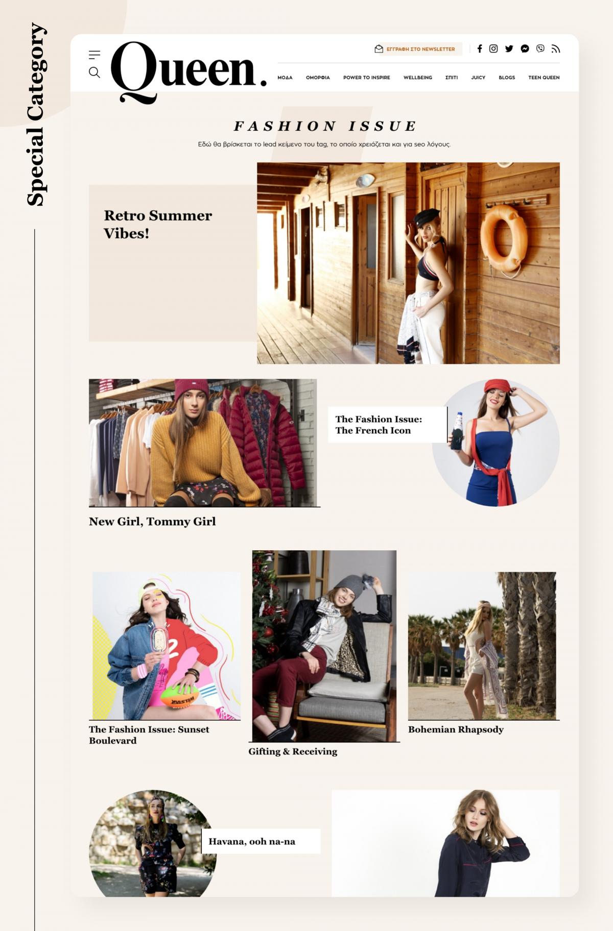
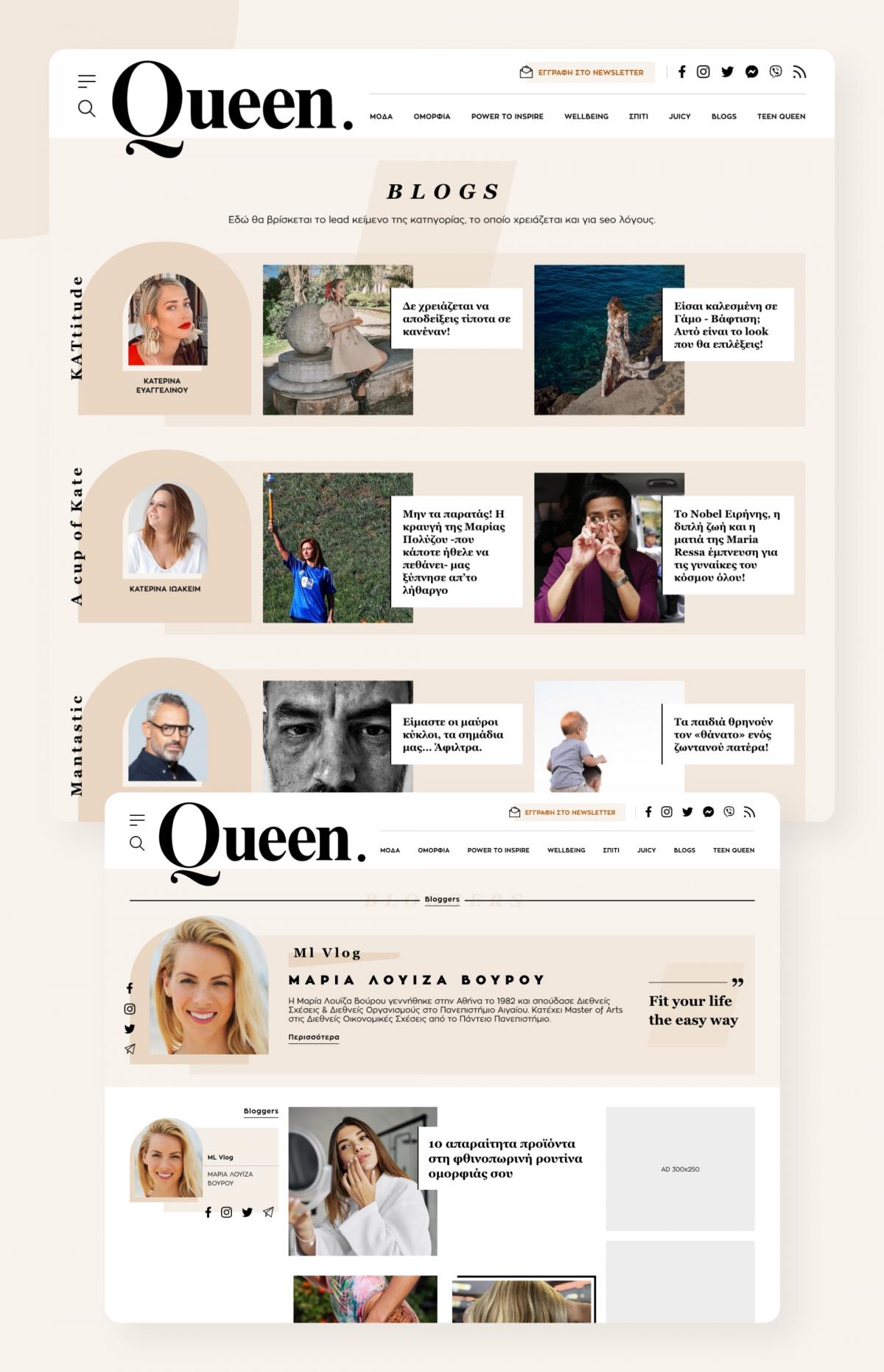
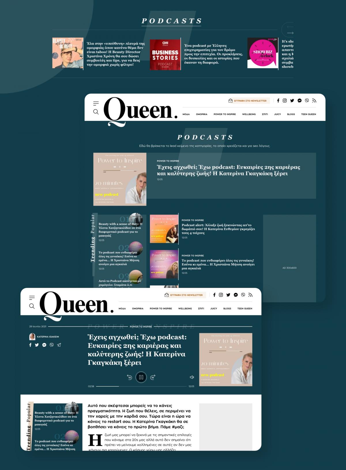
We were entrusted with the UI and UX design for the new Queen website. Our goal was to create a portal dedicated to women, that focuses on the reader and the content, respects the commercial needs of the medium and stands out from the competition.
| Release date | |
| Client | DPG |
| Sector | Fashion, Beauty, News |
| UX / UI Design | Despina Alafouzou |
| Account Management | Frida Pavlidou |
Typography
TYPE YOUR TEXTGeorgia
Zona Pro
Color Palette
HOVER TO EXPLORE ALL COLORS SWIPE TO EXPLORE ALL COLORSFashion, style, beauty, mind; combined
Humans are creatures of habit, which makes every redesign a truly high-level challenge. It requires shaping user behavior without shaking the already existing one.
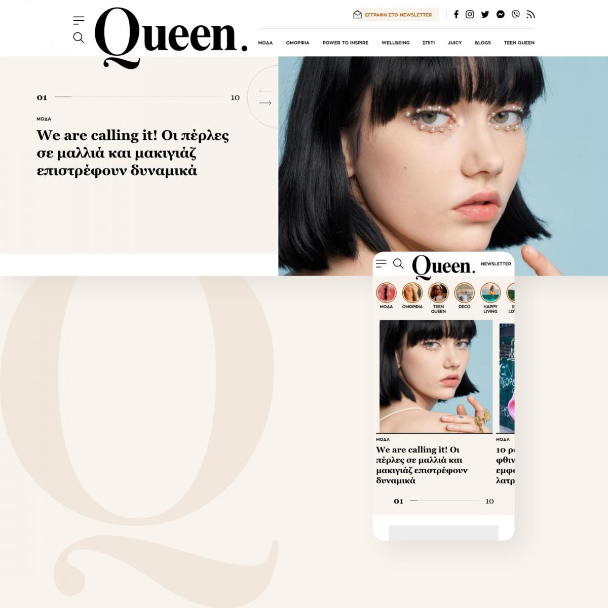
Keeping that in mind, the main goal aesthetically was to promote a minimal and clean magazine feeling. Big and bold serif typography was combined with a distinct modern one to boost the print idea. Neutral earthly tones were chosen carefully to reinforce the powerful connection between the nature and woman. Geometric curvy shapes and images blend with asymmetrical straight lines to embrace the feminine while sophisticatedly luxurious essence of the medium and its content.
The rich range of topics and modern view of everyday life issues which identifies Queen was structured and displayed clearly, so that the user can navigate easily through all the content and focus on what matters. Each type of content was designed in a well-defined way, so that it blends with the rest information, but separates its purpose easily at the same time. Advertising elements were carefully placed with user experience primarily in mind to serve the medium's needs.
Queen.gr is a premium site for the modern woman of any age: bold, stylish, elegant, complicated yet simple; everything that describes its new home.
* Internally developed by DPG.


